Royal Art Historian Amanda Matta’s take on King Charles’ modern portrait
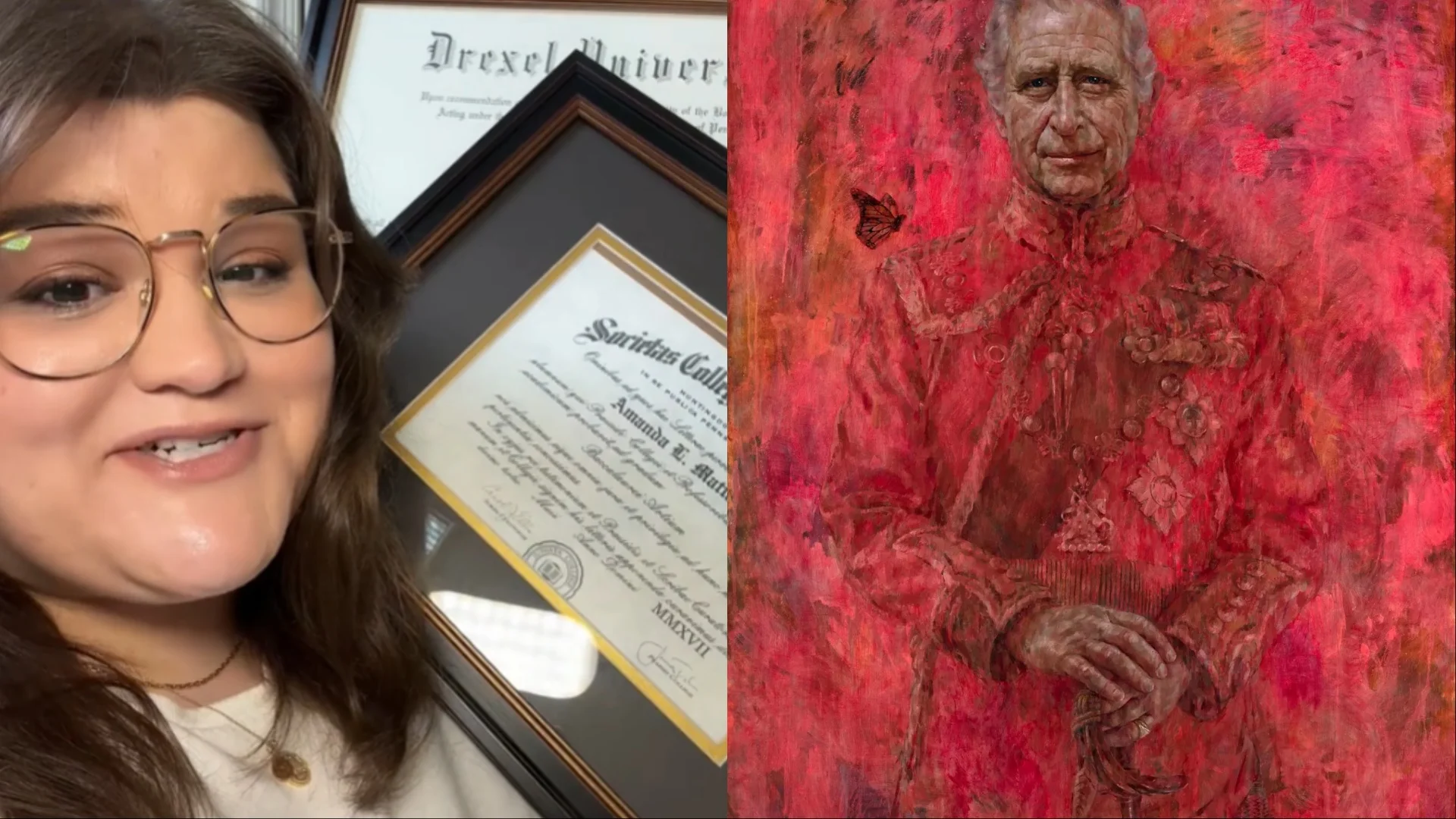
In a recent TikTok video, Amanda Matta (matta_of_fact), shared her thoughts on the newly unveiled official portrait of King Charles. As a well-known and trusted Royal historian, Matta dusted off her art history degrees to offer a detailed critique of the portrait, which was painted by British artist Jonathan Yeo.
A Contemporary Portrait
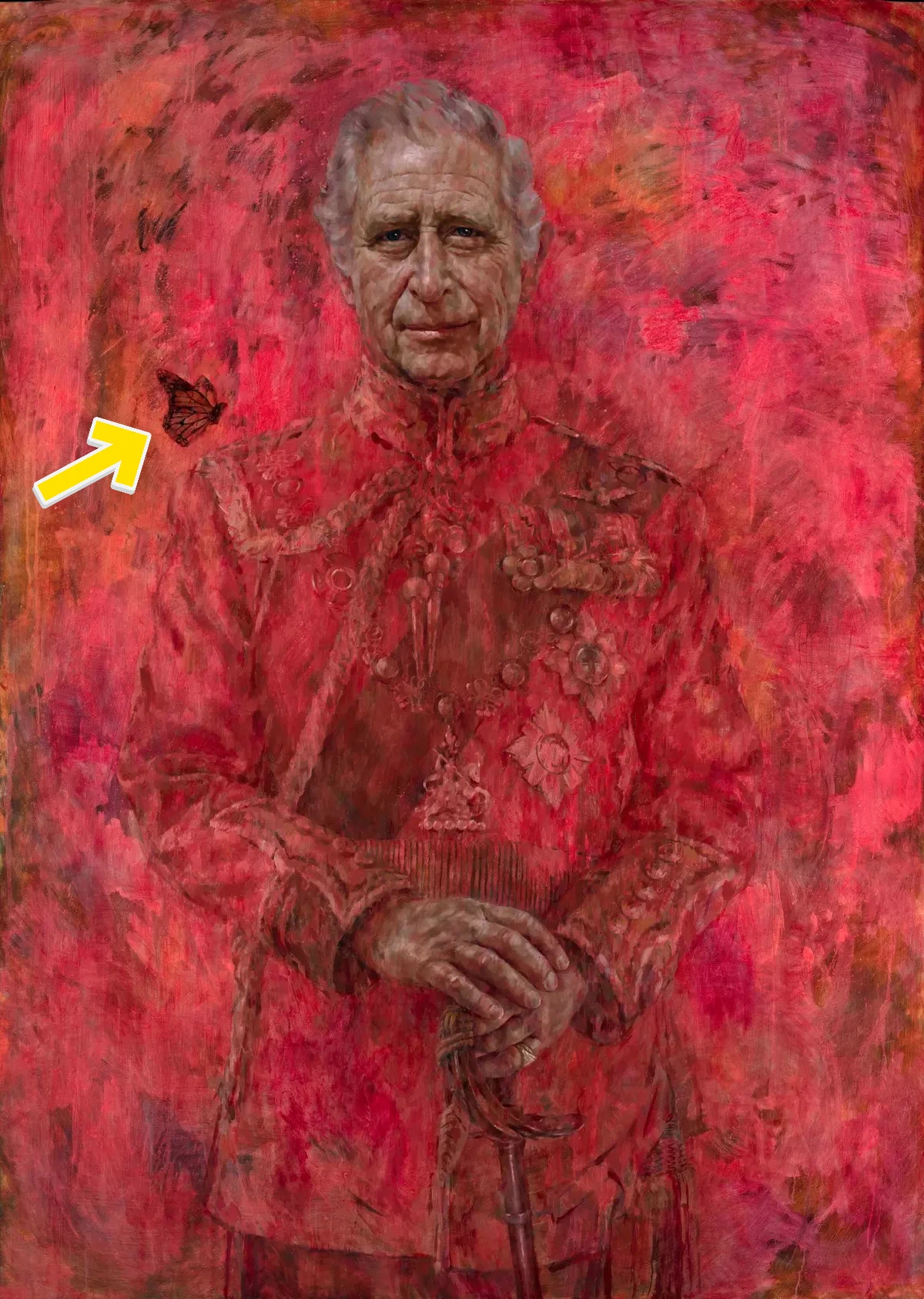
The portrait in question is the first completed image of King Charles since his coronation. Painted by Jonathan Yeo over four separate sittings beginning in 2021, the king himself was present for each session. Matta emphasizes that Charles knew exactly what the final product would look like and approved it.
Art Historical Perspective
Approaching the portrait from an art historian’s viewpoint, Matta describes it as a “very contemporary portrait of King Charles III” with notable symbolism. Three key elements immediately stood out to her:
- The Color: Described as “abrasive,” Matta expresses significant concern over the portrait’s color. Despite her appreciation for contemporary portraiture, she finds the vibrant red troubling. The color choice does not align with the traditional purpose of a royal portrait, which is to convey a specific message about the monarch and their reign. Historically, royal portraits have depicted monarchs in stately poses, symbolizing power and authority. The bold red in King Charles’ portrait, however, detracts from this objective.
- Military Uniform: Charles is depicted in the formal military uniform of the regimental Colonel of the Welsh Guards, a title he has held since 1975. This choice connects to his long tenure as the Prince of Wales.
- The Butterfly: In art history, butterflies symbolize rebirth due to their metamorphic life cycle. Yeo’s inclusion of a butterfly on Charles’ shoulder hints at his transition from prince to king and his interest in environmental issues. According to Yeo, Charles himself suggested the butterfly to symbolize his kindness and gentleness.

Courtesy of Jonathan Yeo
Comparisons and Criticism
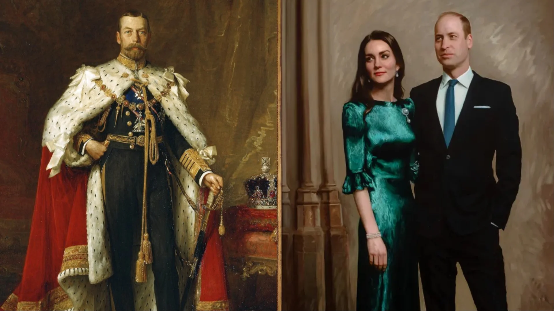
Matta draws comparisons to other royal portraits, noting that traditional images, like those of King Charles’ great-grandfather George V, communicate strength and authority. Even more modern portraits, like those of Prince William and Kate as the Prince and Princess of Wales, balance regalness with approachability.

Courtesy of Jamie Coreth (Fine Arts Commissions)
She critiques the red color as unsympathetic and recalls unfavorable comparisons to scenes from movies like “The Shining” and “Ghostbusters.” To illustrate alternatives, Matta experimented with different colors: green for environmental themes, blue for a sympathetic tone, and yellow for a happier feel. However, she found none satisfactory, noting that yellow made Charles look like King Midas, which clashes with efforts to dispel perceptions of the monarchy’s extravagance.
@matta_of_fact Let’s use my #arthistory degree today and talk about the controversial new #royal portriat of #KingCharles 🫣🖼️ #royalfamily #britishroyalfamily #royals #royalportrait #royaltea #royalnews #britishroyals #charlesandcamilla #queenelizabeth #royalgossip #royalexpert #arthistorian king charles portrait portrait of king charles worst royal portraits #greenscreenvideo #greenscreen
Historical Context and Reception
Matta points out that unfavorable royal portraits are not unprecedented. Queen Elizabeth II faced similarly unflattering depictions during her reign. She cites a portrait by Lucian Freud that failed to convey the intended message of strength and capability. Conversely, she acknowledges that royal portraits can succeed in contemporary styles, highlighting Jonathan Yeo’s previous works of the Duke of Edinburgh and Camilla, Duchess of Cornwall.
JC Paredes
Since March 2021, I've worn two hats at Spiel Times: a writer and a Managing Editor. In my writing role, I've earned recognition from Wikipedia and Nev Schulman (Catfish TV Show host) for my insightful analysis and engaging narrative style. I'm passionate about all things gaming, with a keen eye for detail and a knack for uncovering hidden secrets within games. My gaming journey began at a young age, captivated by titles like Resident Evil and Tomb Raider. Today, I enjoy exploring open-world RPGs and MMORPGs, consumed by their lore and crafting theories about their narratives. I'm also drawn to the suspenseful atmosphere of horror games and the intricate narratives of crime-themed titles, bringing a unique perspective to my writing. Beyond gaming, I have a fascination with anything unexplained and chilling, a passion that often spills over into my exploration of horror games. When I'm not engrossed in a virtual world, you can find me curled up and spending time with my adorable doggy sidekick, Teemo. As Managing Editor, I'm committed to fostering a collaborative and supportive environment for our writing team. I communicate openly with my team members, addressing any content-related issues and providing guidance to help them excel.
View all articlesRelated Articles
View All
Nintendo faces fallout from unprecedented game leaks
Inside Nintendo, the mood shifted sharply after reports of a massive leak appeared online. What began as speculation soon turned...

Dell Gaming Laptops: The Smart Choice. Why the G-Series is the Wise Gamer’s Secret Weapon
We are living in a golden age of PC gaming. Games are more beautiful, more complex, and more immersive than...

Sims Rival InZOI Announces Official Release Date After Unexpected Delay
The highly anticipated life simulation game InZOI has officially announced its Early Access release date after an unexpected delay, much...